A critical platform with no shared voice
Mercado Público is Chile’s government procurement platform — hospitals, municipalities, and ministries use it daily to acquire everything from medical supplies to infrastructure services. With over one million active users and billions in annual transactions, inconsistency has a direct cost.
When I joined to lead the Design System, the core problem was not the absence of components. It was the absence of design authority. Five product teams were building independently, each applying their own content conventions. Some flows read like legal filings. Others read like internal IT memos. None of them sounded like a platform built for people.
The system had visual foundations. What it lacked was a shared criterion: a principled approach to deciding what to say, how to say it, and why it matters. That gap was visible in every screen — buttons that introduced doubt instead of resolving it, error messages that reported failures without offering paths forward, labels that were only legible to people who had been on the team for years.
What we found when we looked carefully
Before proposing any solution, I ran a diagnosis of the current state of content. I reviewed complete flows, labels, system messages, CTAs and internal documentation. What I found was revealing.
”Cancel” on a button that was actually confirming a payment.
Finding in direct acquisition flow
Internal abbreviations, CM, RFI, OOPP, without context or glossary.
Finding in tenders module
Error messages that described the problem but offered no way out.
Finding in form validations
The same concept named three different ways on three consecutive screens.
Finding in purchase order flow
Anglicisms like backoffice mixed with legal jargon, with no clear hierarchy.
Finding in system documentation
Instructions written in passive voice that diluted the system’s responsibility.
Cross-cutting finding across more than 12 screens
The diagnosis confirmed what I suspected: the problem was not the absence of content, it was the absence of criterion. Nobody knew which words to use because nobody had defined how this platform should sound.
Establishing a shared editorial standard
Before defining principles, I needed a practical filter — a single question that any team member could apply to any piece of content, without specialized training in UX writing.
Would a real person say this?
If the answer was no, it needed to be rewritten. Simple enough to use in any review, precise enough to drive real decisions. This became the editorial north star of the system.
From there, I worked in close alignment with ChileCompra’s Communications team to formalize the content principles. The goal was not a style guide that lives in a document nobody reads. It was a set of criteria embedded directly into the design workflow — applicable at the component level, the pattern level, and the product level simultaneously.
Clear
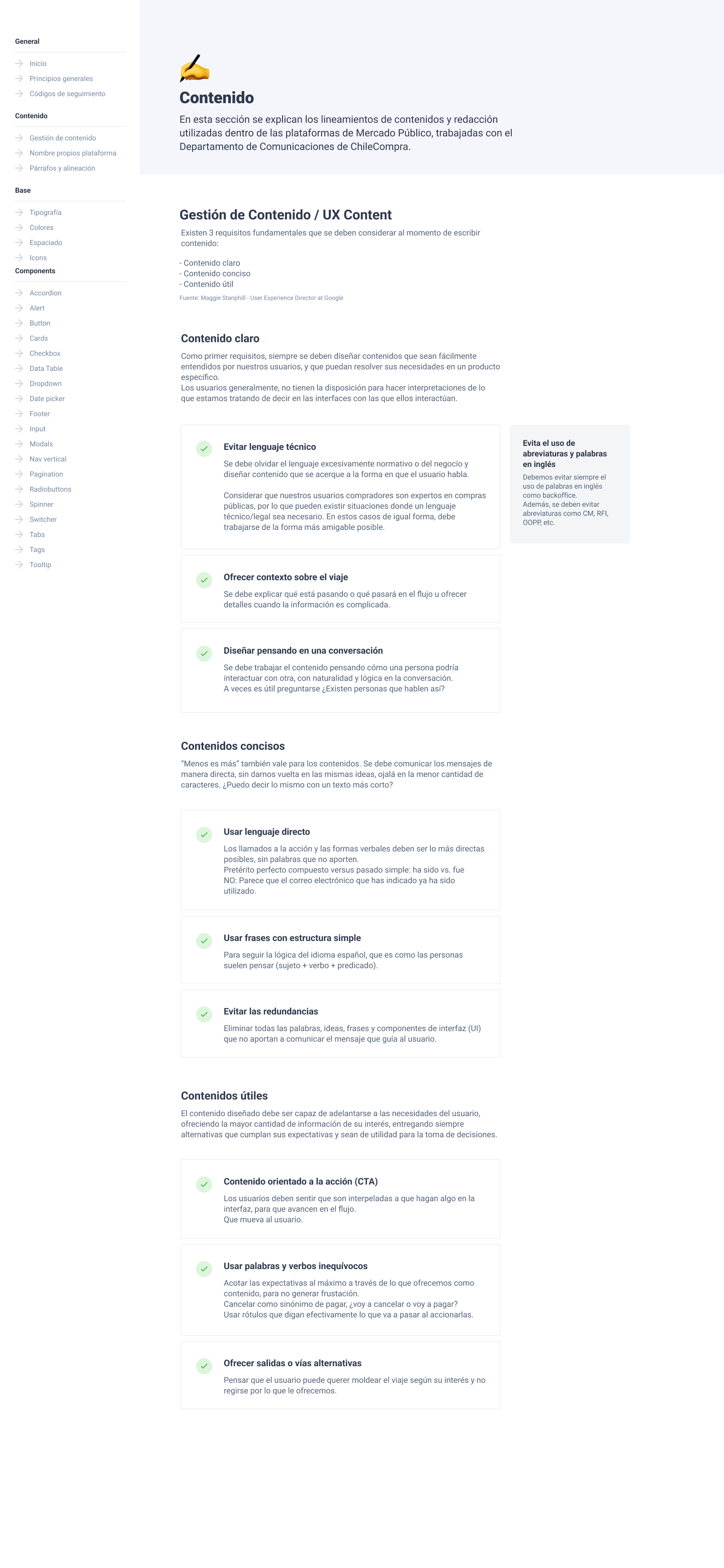
The user understands what is happening and what they can do. No ambiguity, no unnecessary jargon, no phrases that need to be read twice.
Concise
Only what is necessary. Extra content is not neutral: it distracts, delays and creates friction. Every word has to earn its place.
Useful
Content guides, not just informs. It tells the user what to do, not just what happened. It anticipates doubts and offers paths forward.
The structure of the system
The Design System was organized following atomic design principles, with an additional layer not usually present in traditional systems: content guidelines as a constitutive part of the system, not as an appendix.
Design tokens
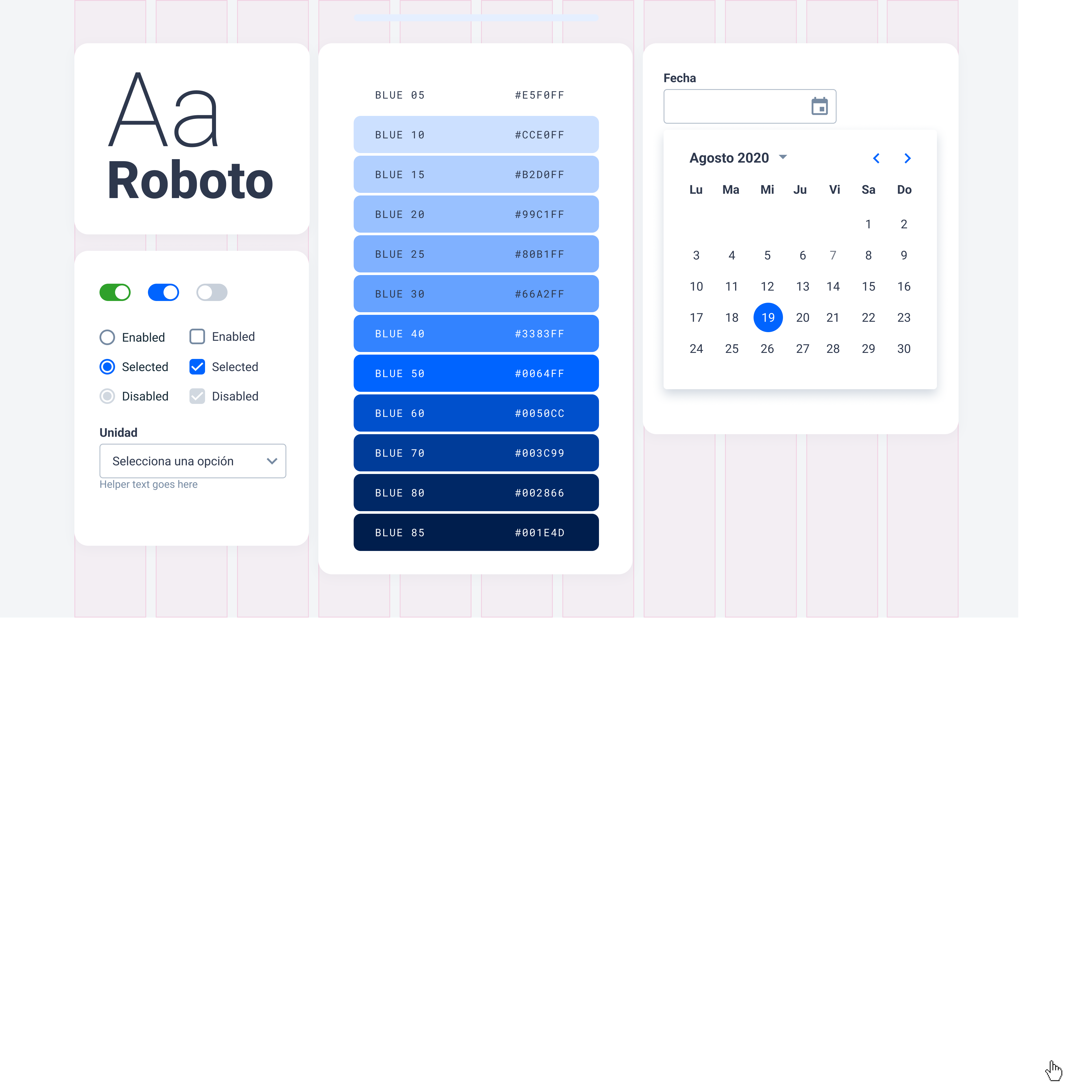
Colors, typography, spacing, radii, shadows. The primitive values that feed everything else.
Base components
Buttons, inputs, labels, icons, badges. The smallest building blocks with their states and variants.
Composite patterns
Forms, cards, modals, tables, navigation. Components that combine atoms with logic.
Content guidelines
Principles, writing patterns, tone by context, CTA guide, error handling, glossary.
A value system that scales
To establish a consistent and sustainable visual system, we defined a three-level token architecture. The logic: any global change, a rebrand, a new theme, could propagate from a single place.
Primitive tokens
Raw values: all possible colors, typographic sizes, spacing units and radii. They have no semantics yet, they are the complete vocabulary of the system.
color.blue.500spacing.4font.size.lgSemantic tokens
Values with purpose. They give meaning to primitives and communicate usage intent. These are the ones design teams use directly.
color.action.primarycolor.feedback.errorspacing.component.gapComponent tokens
The most specific. They define the values of each individual component, mapped to semantic tokens. They are the bridge between design and development.
button.primary.backgroundinput.border.focusbadge.text.colorEvery component is a content decision
What I learned building this library is that a component without content criterion is just a shell. A button without a labeling guide can create confusion. An error message without a writing pattern can frustrate at the worst moment.
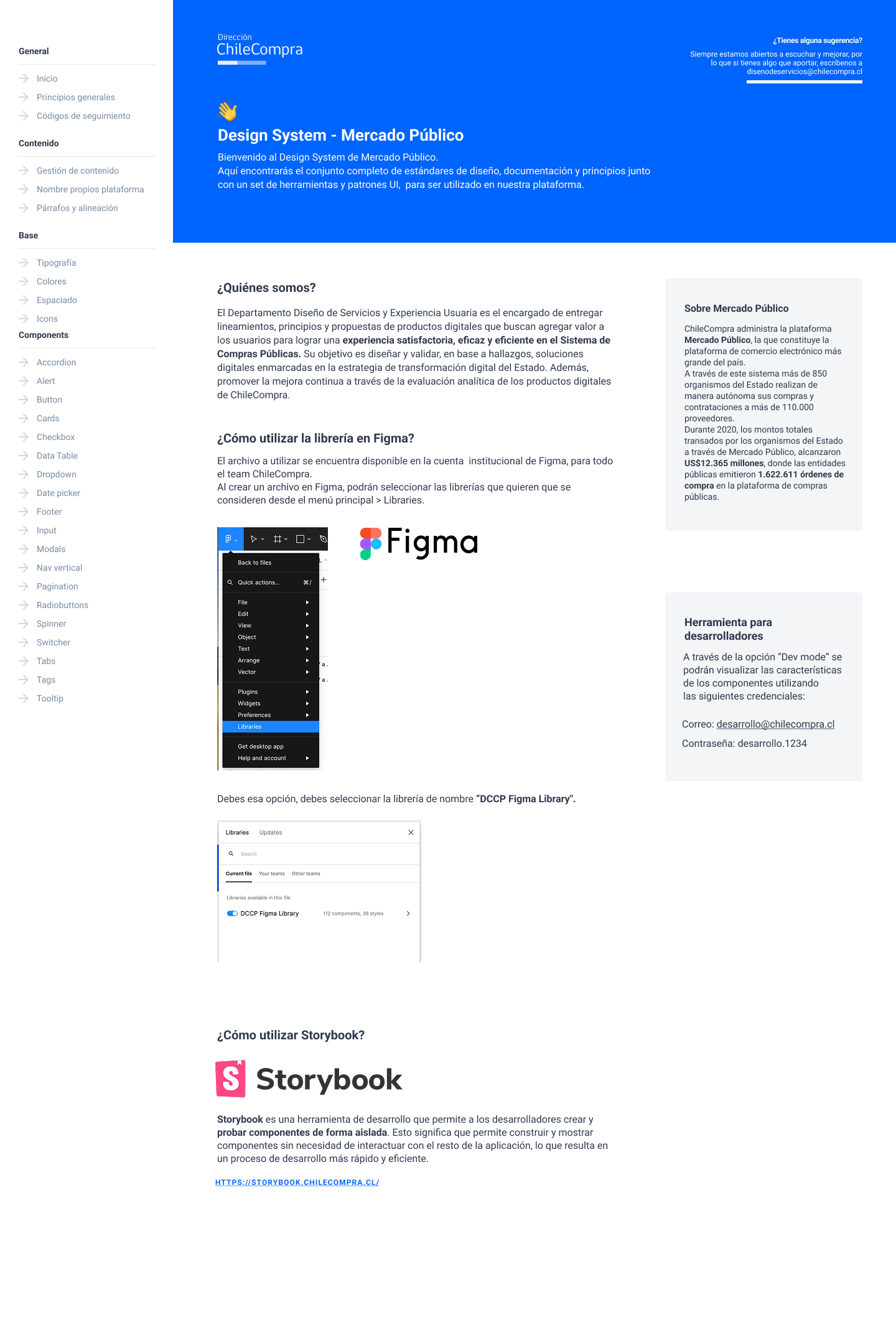
Every component in the library was designed with its states, variants and interactions, but also with its content guidelines integrated directly into the documentation.
Configurable
Every component exposes its properties in Figma so teams can configure variants, states and content from a single panel, without breaking the structure.
Full states
Default, hover, focus, disabled, error, loading. Every state documented with its visual behavior and content criterion.
Accessible
Contrast validated against WCAG 2.1 AA, ARIA labels documented, focus hierarchy defined. Accessibility as a design criterion, not a final review step.
Scalable
Built with auto-layout and tokens to work across different contexts without losing coherence. Designed for five different products, with a single source of truth.
Content guidelines: the layer that changes everything
This was the part of the system that was hardest to argue for and had the most impact. The content guidelines did not live in a separate Drive document. They were integrated into the system with the same weight as typography or colors.
Prefer simple past tense
The request has been processed successfully.
The request was processed successfully.
Simple past is more direct and more human. Passive voice dilutes and lengthens.
CTAs as promises
Continue
Submit request
A CTA is a promise: it tells the user exactly what is going to happen. That promise must be kept.
Errors that guide
Error processing the request. Code: 403.
You don’t have permission to view this. If you think this is an error, contact your organization’s administrator.
Errors point out the problem AND offer a way out. The user should never be left without options.
Offer paths forward
To continue, you must complete all required fields.
The company tax ID is missing. You can also save as draft and come back later.
Not everyone wants to follow the path we designed. Content has to anticipate that.
The nuance of the technical and legal
Mercado Público has a particularity that complicated some decisions: its buyer users are experts in public procurement. That means there are technical and legal terms that cannot be eliminated. Tender, direct purchase, award, these are concepts from the professional vocabulary of the people who use the platform.
The challenge was not to simplify at any cost. It was to find the balance where necessary technical language coexists with the greatest possible clarity for those who are just getting started. That nuance was explicitly documented in the system.
Rule we defined: if the technical term exists because it is legal or regulatory, it stays and is contextualized. If it exists because “it has always been said that way,” it is evaluated and probably replaced.
How it was built
The system was not delivered all at once. It launched incrementally, prioritizing the highest-use components and the most urgent guidelines first. At each stage, feedback was collected from the teams using it.
Diagnosis and principles
Audit of existing content, team interviews, definition of principles together with Communications.
System foundation
Definition of primitive and semantic tokens, color palette, typography, spacing. The base on which everything is built.
Atomic components
Buttons, inputs, badges, icons. Each with complete states and integrated content guidelines.
Composite patterns
Forms, tables, modals, navigation. Components with more complex logic and greater content dependency.
Voice and tone guidelines
Complete writing guide, CTA patterns, error handling, glossary of technical terms and simplification criteria.
What changed
The content guidelines were integrated into the Design System with the same weight as typography, colors or components. Not as an appendix. As a living part of the system, accessible in the same tool where teams design.
That changed something concrete: teams stopped making content decisions intuitively and started having shared criteria. Reviews happened earlier in the process. The platform started to sound more consistent, more coherent, more human.
Key takeaways
This project confirmed something I believe deeply about systems design: content decisions are architecture decisions.
Defining how a product speaks is not a last-minute detail. It is a choice that runs through every screen, every flow, every moment a user needs to understand what is happening and what they can do.
When that decision is made carefully and documented well, the result is not just a more consistent platform. It is a platform that feels more trustworthy.