Data-driven decisions, not intuitions
LATAM operates with a prototyping and design process aligned to OKRs. The goal is not to design what looks best, it is to make decisions based on effective and reliable tests with real users. Every change needs measurable justification.
The fares display is one of the most critical moments in the purchase funnel: it is where the user decides which fare to choose and whether to add extra services. An unclear design at that point directly affects revenue per session.
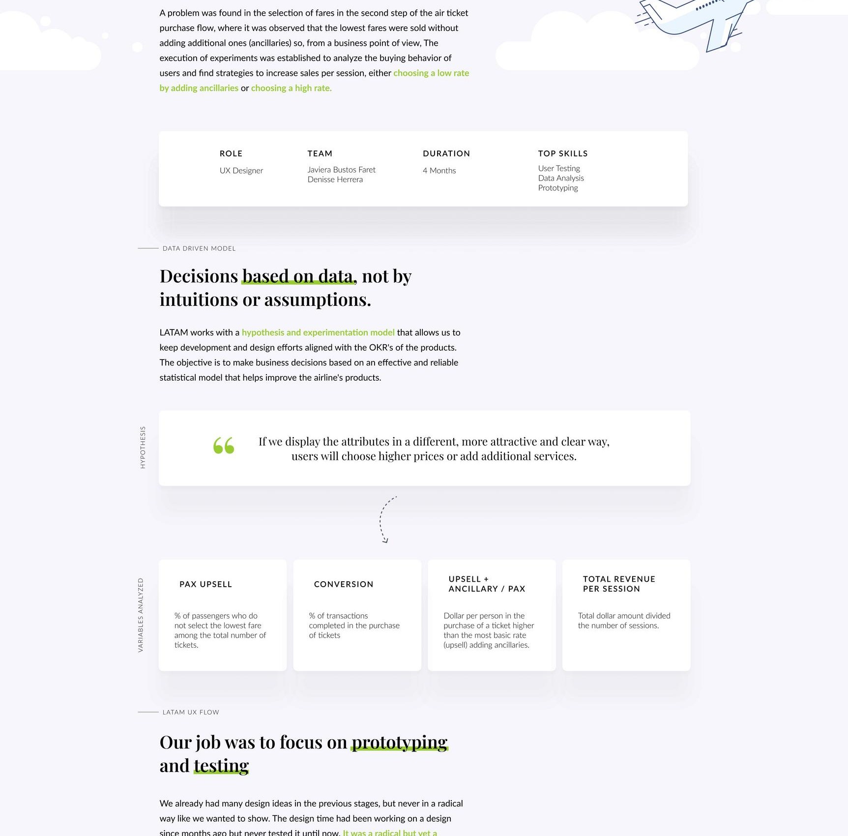
If we show fare attributes in a more appealing and clear way, users will choose higher fares or add additional services.
That was the hypothesis guiding the project. The design had to prove it, or disprove it, with data.
The focus was on prototyping and testing
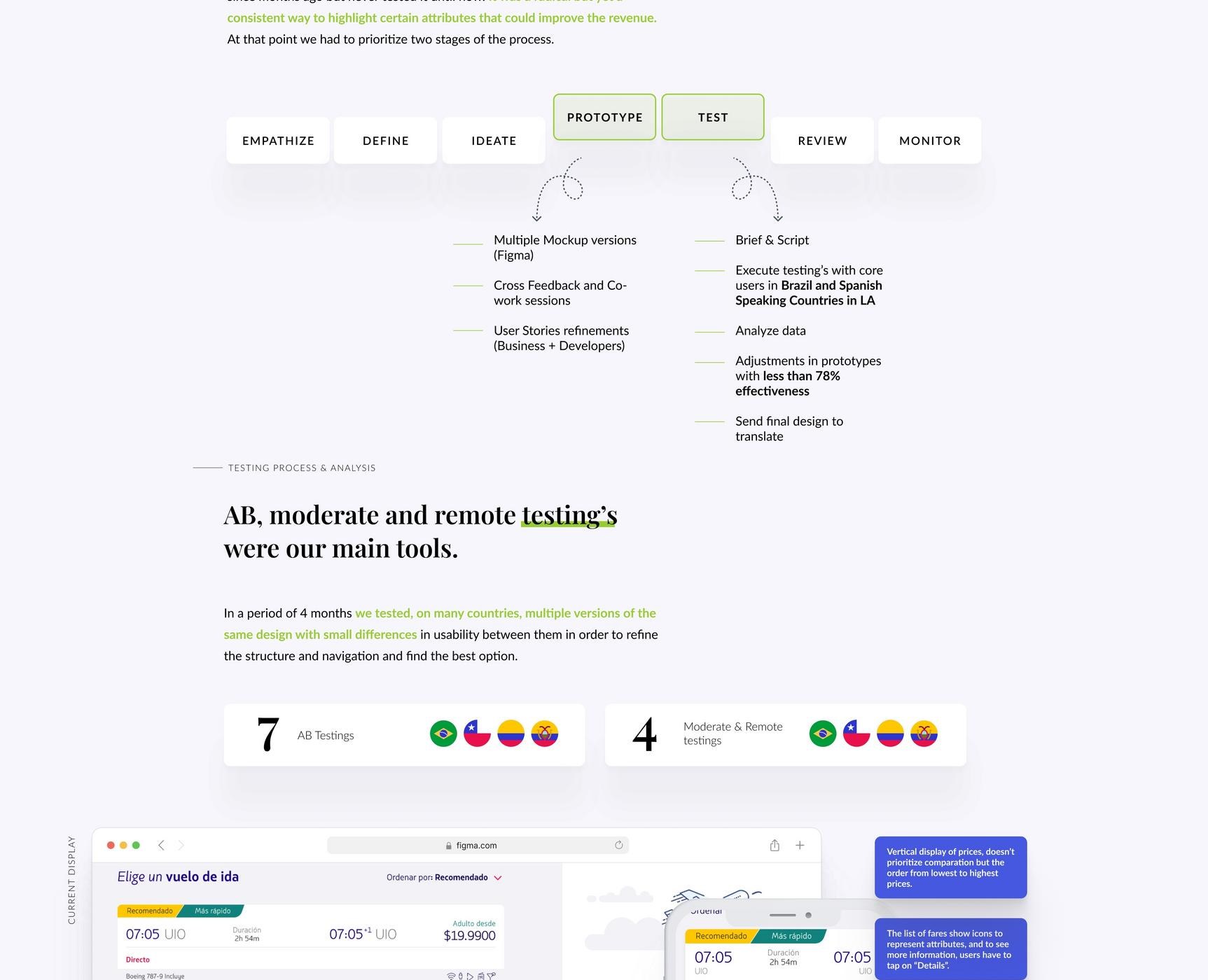
The process was not linear, it was iterative from day one. The workflow was organized in short cycles of prototyping and testing, validating specific hypotheses before moving to the next fidelity level.
Prototyping alternatives
Exploration of different ways to present fares, including visual hierarchy, attribute highlighting and comparison between options. Each alternative responded to a specific hypothesis about user behavior.
A/B Testing
The most promising variants were tested with real A/B testing in production, measuring the direct impact on revenue per session, conversion and fare upsell.
Moderated and remote testing
Sessions with real users to understand the reasoning behind decisions, what they read first, what confuses them, what helps them choose with confidence.
Synthesis and iteration
Findings from each testing round fed the next design iteration. The cycle repeated until we had a proposal with solid evidence to implement.
The initial proposal on screen
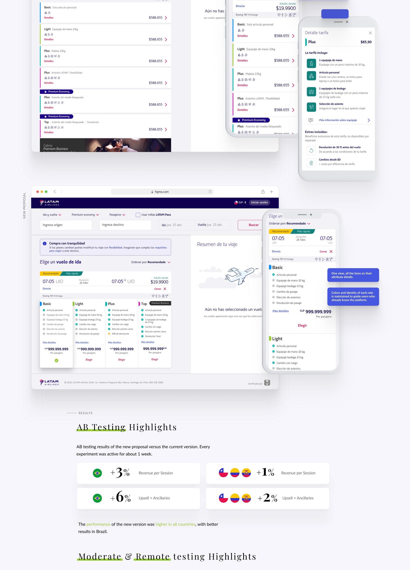
The first version of the new display aimed to improve visual hierarchy and make the attributes of each fare more readable. The design was tested on both desktop and mobile, the two main ticket purchasing contexts.
Data sets the direction
A/B testing and moderated sessions delivered clear findings about what worked and what did not. Quantitative results were complemented with qualitative insights from moderated testing to understand the why behind the numbers.
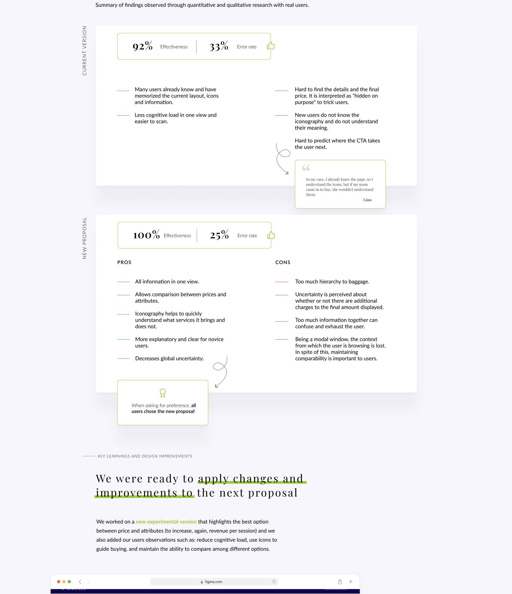
Testing did not confirm the initial hypothesis on all points. That was not a failure, it was exactly the information we needed to know where to adjust in the next iteration.
Ready to apply improvements to the next proposal
With testing findings integrated, the final proposal incorporated the specific changes supported by evidence, not all possible changes, only those the data justified. The result was a clearer display with better hierarchy and greater capacity to communicate the value of each fare.
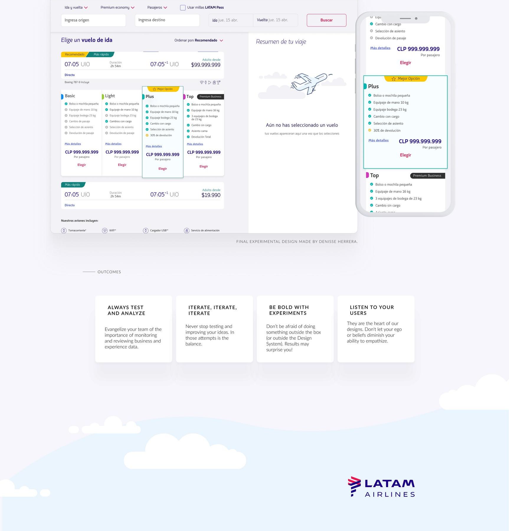
What changed
100% data-driven
Every design decision backed by testing data, no assumptions, no personal preferences.
Short iteration cycles
Prototype, test, synthesize, iterate. Without waiting for everything to be perfect before validating.
3 testing methods
A/B testing, moderated testing and remote testing in parallel to get both quantitative and qualitative perspectives.
Aligned to OKRs
The design was aligned to business objectives from the start, with revenue per session as the north star metric.