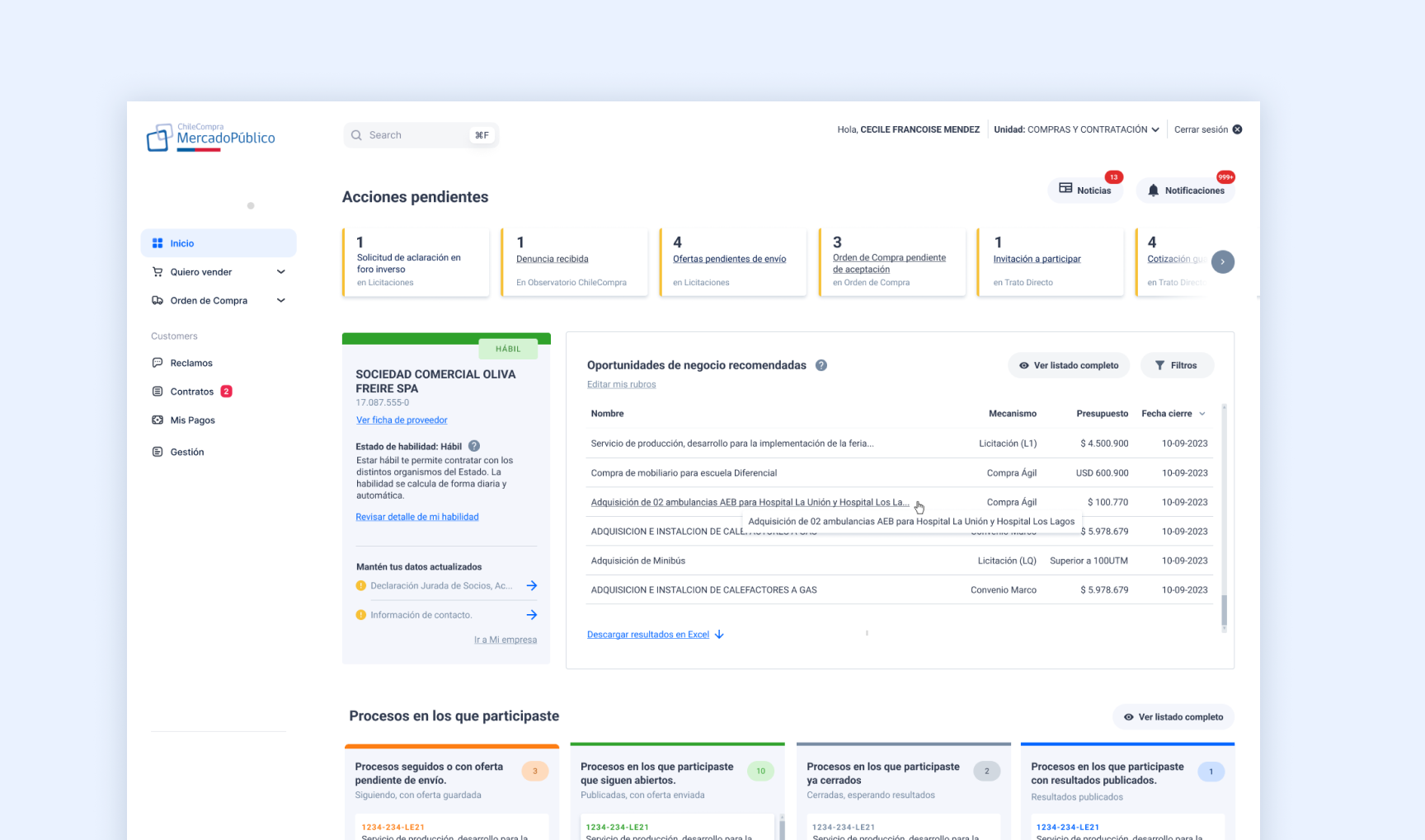
A dashboard that didn’t know what it was for
In Mercado Público, providers are the companies and individuals that sell to the government. Every time they log into the platform, the first thing they see is their dashboard: a home panel with summaries, shortcuts and notifications.
The problem was that this dashboard showed information without hierarchy. Everything had the same visual weight. A tender expiring in two hours looked the same as a monthly statistic that could be checked any day. To understand what they had pending, providers had to navigate between sections, click in multiple places, and remember paths.
A platform that was supposed to make providers’ businesses more efficient was stealing their time from the very first second.
Understand before redesigning
Before opening Figma, I needed to understand how providers actually used the dashboard, not how we assumed they did. I conducted in-depth interviews with providers from different industries and sizes, from micro-businesses to medium-sized companies with dedicated public procurement teams.
Questions revolved around their daily routine: what is the first thing they check when they log in, what information do they actively look for, what do they miss or discover late, what generates anxiety or uncertainty.
”I come in and the first thing I do is go straight to tenders, because the home tells me nothing.”
Technology services provider
”Sometimes I find out I lost a tender through email, not through the platform.”
Office supplies provider
”Purchase orders are the most critical thing for me. If I don’t accept them on time, I lose the business.”
Maintenance services provider
”I don’t know when my contracting eligibility expires. I find out when I can no longer operate.”
Construction sector provider
”The dashboard shows me things from months ago. Why would I want to see that first.”
Cleaning services provider
”I have to remember to check if there is anything new. The platform doesn’t notify me properly.”
Food sector provider
The pattern was clear: the existing dashboard did not prioritize. It showed everything equally, with no distinction between urgent and informational, between what required immediate action and what could wait. Providers had developed workarounds, going directly to other sections, using email as an alert system, remembering dates on their own.
The platform was transferring its own cognitive load onto them.
The principle that shaped the entire design
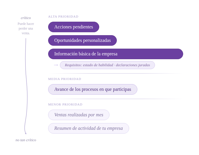
From the most urgent for the business, to the least critical.
It is not about showing more information, it is about showing it in the right order. The dashboard needs to know what is urgent before the provider even has to ask.
Based on the interviews, I built a hierarchy of provider needs. Not all information carries the same weight. A pending purchase order has immediate consequences. A quarterly sales statistic can be reviewed calmly on any afternoon.
The new dashboard would be structured following that hierarchy: first what requires action today, then what requires attention soon, lastly what is informational.
Pending actions
Purchase orders not yet accepted, tenders with an approaching deadline, required documents. Everything that has a visible deadline.
Eligibility status
ChileProveedores registration validity, documents nearing expiration. What affects the ability to operate on the platform.
Relevant tenders
Active tenders in the provider’s sector, with filters by amount and date. What can turn into business.
Proposal status
Summary of tenders in progress, awarded and under evaluation. To track without navigating between sections.
Statistics and summary
Billed amounts, contract history, business evolution. Useful, but not urgent.
Iterating to find the right form
The prototype went through several iterations before reaching formal testing. Each version was reviewed with the team and key users, adjusting visual hierarchy, the weight of each section and interaction patterns.
One of the most debated decisions was how much information to show in each card. The tension was constant: more context helps make decisions, but too much context paralyzes or overwhelms. The criterion was always the same, show the minimum necessary for the provider to know whether they need to act or not.
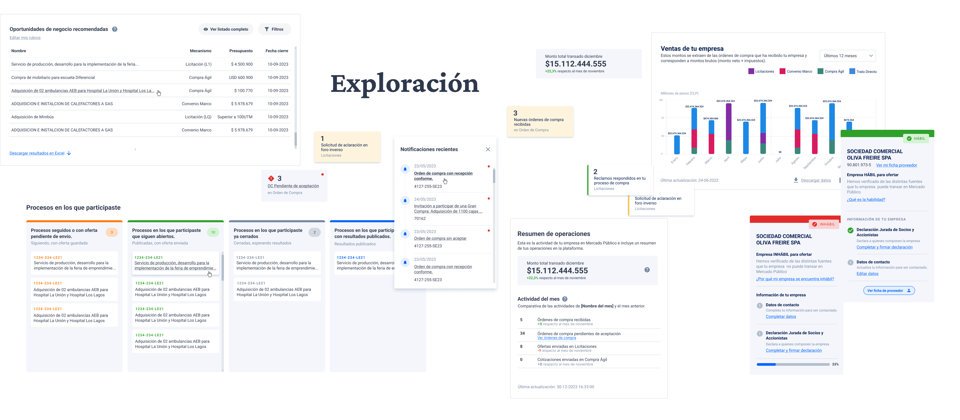
In parallel to visual prototyping, I worked on content architecture: how to name each section, what labels to use, how to write notifications and statuses so they were actionable and not just informational.
The structure behind the interface
The visual design of a dashboard can be perfect and still fail if the content is poorly structured. I worked on information architecture in parallel with design: what to show, what to call it, in what order to present it.
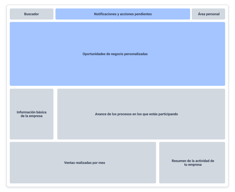
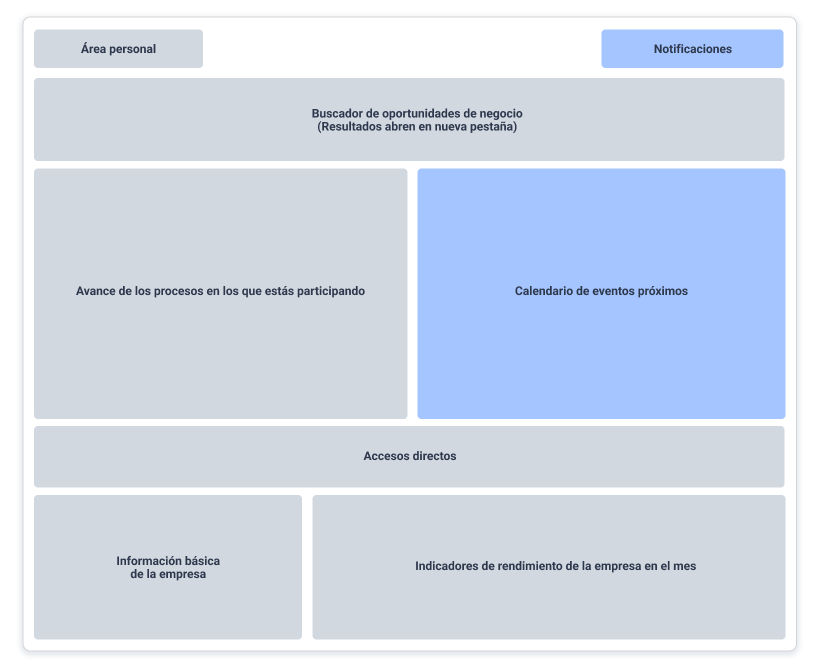
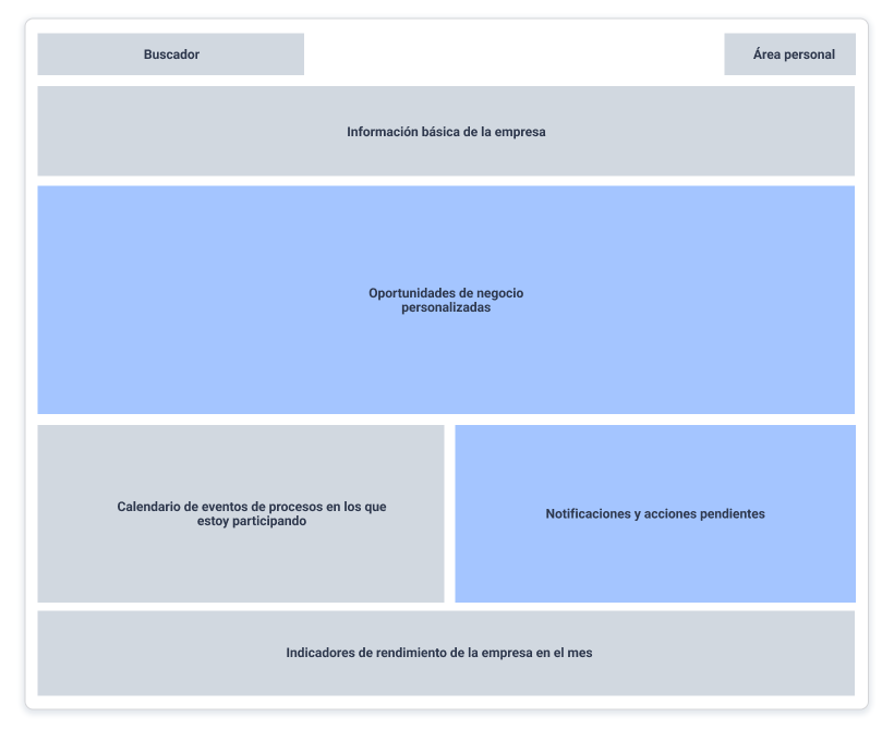
Validating with real users before launch
Usability test sessions compared the previous dashboard with the new prototype. Participants completed concrete tasks: finding a pending purchase order, verifying their eligibility status, identifying relevant tenders for their sector.
The evaluation criterion was twofold: efficiency (time to complete each task) and confidence (whether the user knew they had found the right information).
Key testing finding: on the previous dashboard, several participants completed the task but expressed doubt about whether the information was correct or if they should keep looking. The new hierarchy reduced that uncertainty, users arrived faster and with more confidence.
Before and after
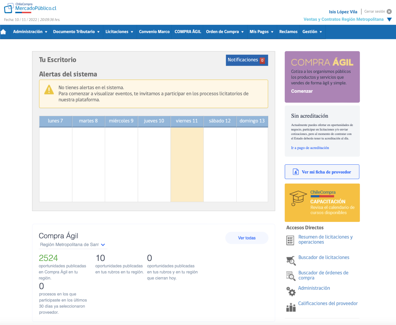
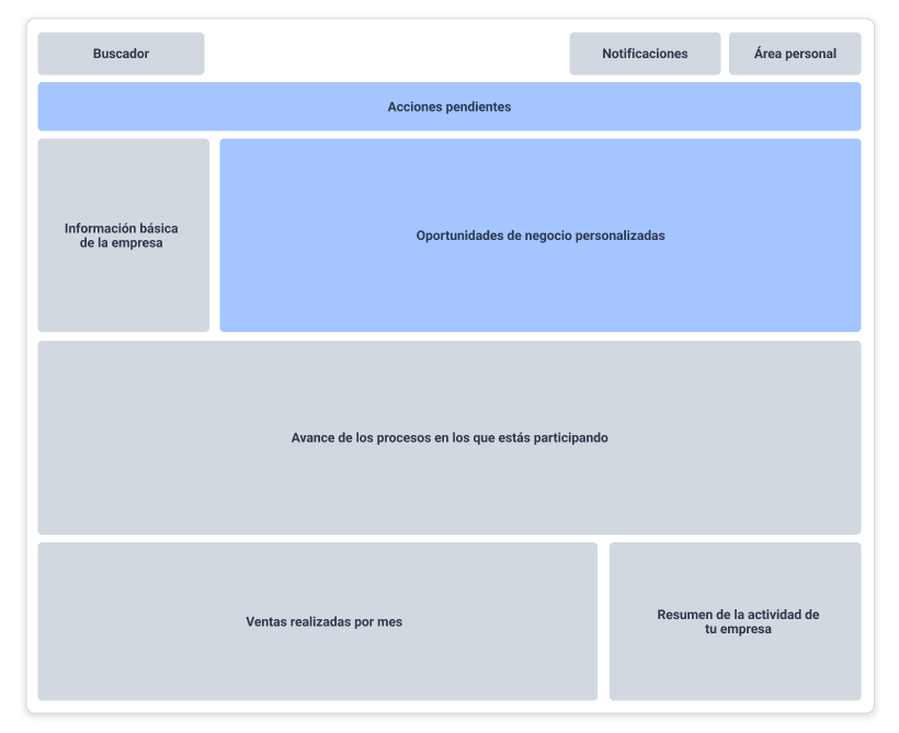
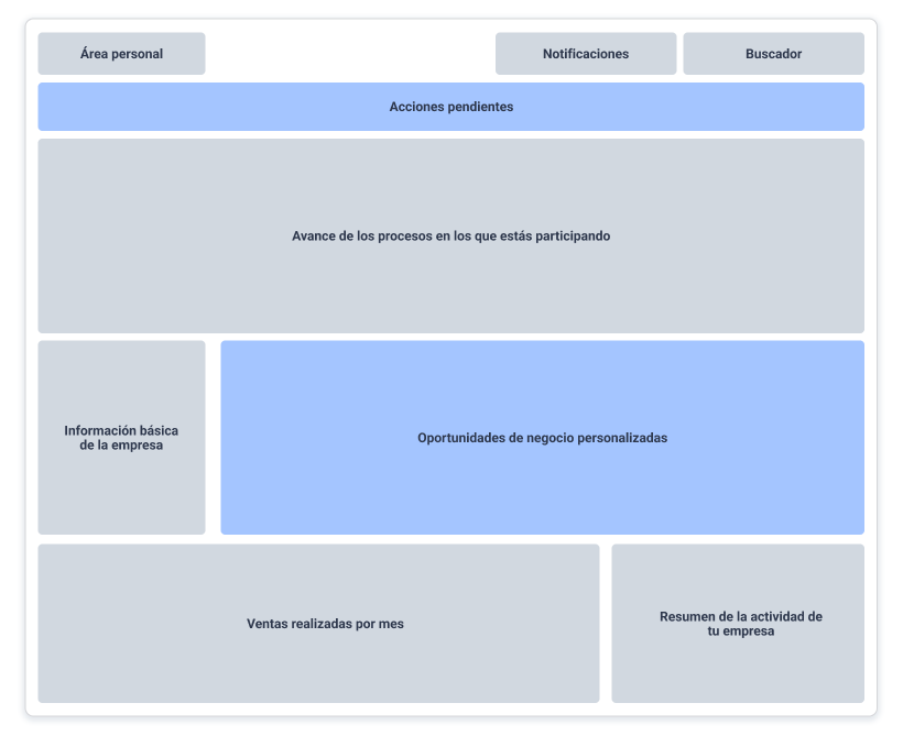
No clear hierarchy. Everything with the same visual weight. Historical information mixed with urgent actions. Providers had to figure out what needed their attention.
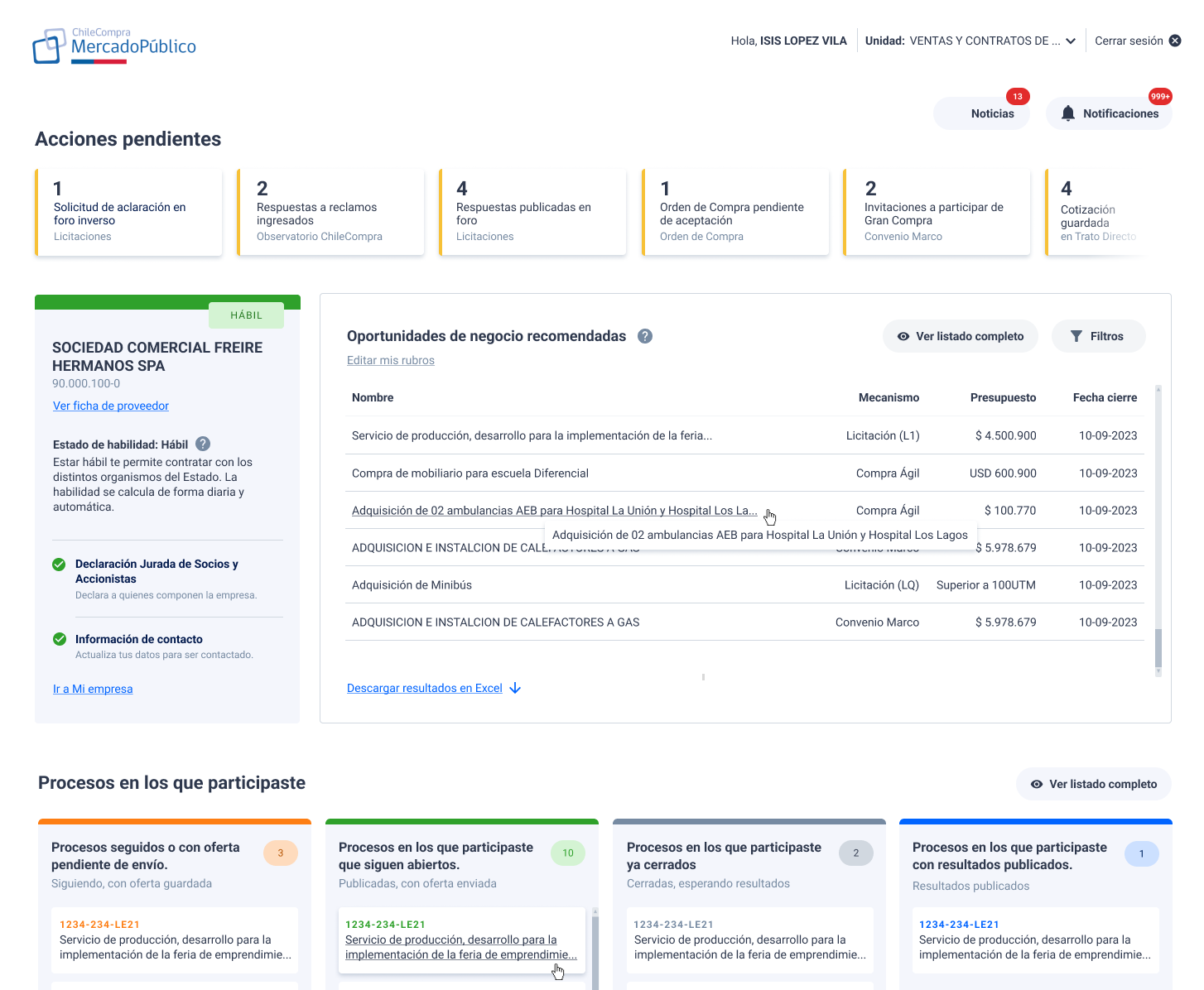
Structure by criticality. The urgent, visible from the first scroll. Pending actions highlighted. Providers know in seconds if there is something that needs attention today.
What we learned after launch
Design does not end at launch. Once in production, we monitored the real behavior of providers to understand whether the redesign delivered on its promise under real conditions, not lab conditions.
Hotjar — heatmaps and sessions
We analyzed session recordings and heatmaps to understand where providers clicked, how far they scrolled, and which sections they ignored. Real behavior sometimes differs from behavior in testing, and those differences are the most valuable.
Exit survey
We implemented an exit survey to collect direct user perception about the new experience. We wanted to know if the hierarchy we designed matched the hierarchy they experienced, if what we put first was really what they needed first.
What changed for providers
Immediate access to urgent items
Pending actions are now visible from the first scroll, without needing to navigate to other sections.
5 sections by criticality
A clear structure that goes from urgent to informational, following the real work logic of providers.
Actionable notifications
Instead of generic alerts, each notification indicates what to do and when, not just that something happened.
Validated with real data
Post-launch behavior was monitored with Hotjar and surveys to iterate based on real usage, not assumptions.
Key takeaways
This project taught me that the main problem with many dashboards is not that they show too little information, it is that they show it without criterion. Adding more data solves nothing if there is no hierarchy telling the user what to look at first.
The most important design decision was not visual: it was defining what is urgent and what is not for a Mercado Público provider. Everything else flowed from there.